Plaster cornices have been around since ancient Roman times, but they're making a serious comeback in modern homes. These architectural details sit where your walls meet the ceiling, and honestly, the difference they make is kind of crazy. If you're thinking about upgrading your space, elegant decorative plaster cornice designs can completely change how a room feels without knocking down any walls or spending a fortune on renovations. The best part is that plaster work has this timeless quality that works whether your home is traditional or super contemporary. Research from interior design studies shows that adding architectural details like cornices can increase perceived room value by up to 15%, which is pretty significant when you think about it.
Why Plaster Still Beats Modern Alternatives
Look, I get it. There are foam and polyurethane options out there that cost less and install faster. But here's the thing about real plaster that nobody tells you upfront: it ages differently. Synthetic materials can yellow over time, especially near windows where UV hits them. Plaster? It actually gets this beautiful patina as years go by.
The density of gypsum plaster also affects how light plays across the surface. When you run your hand along a quality plaster cornice, you can feel the weight and substance. That's because traditional plaster cornices are made from gypsum mixed with reinforcing fibers, creating a compound that hardens to approximately 1200-1500 PSI compressive strength. Compare that to expanded polystyrene foam at maybe 25 PSI, and you start seeing why plaster feels more permanent.
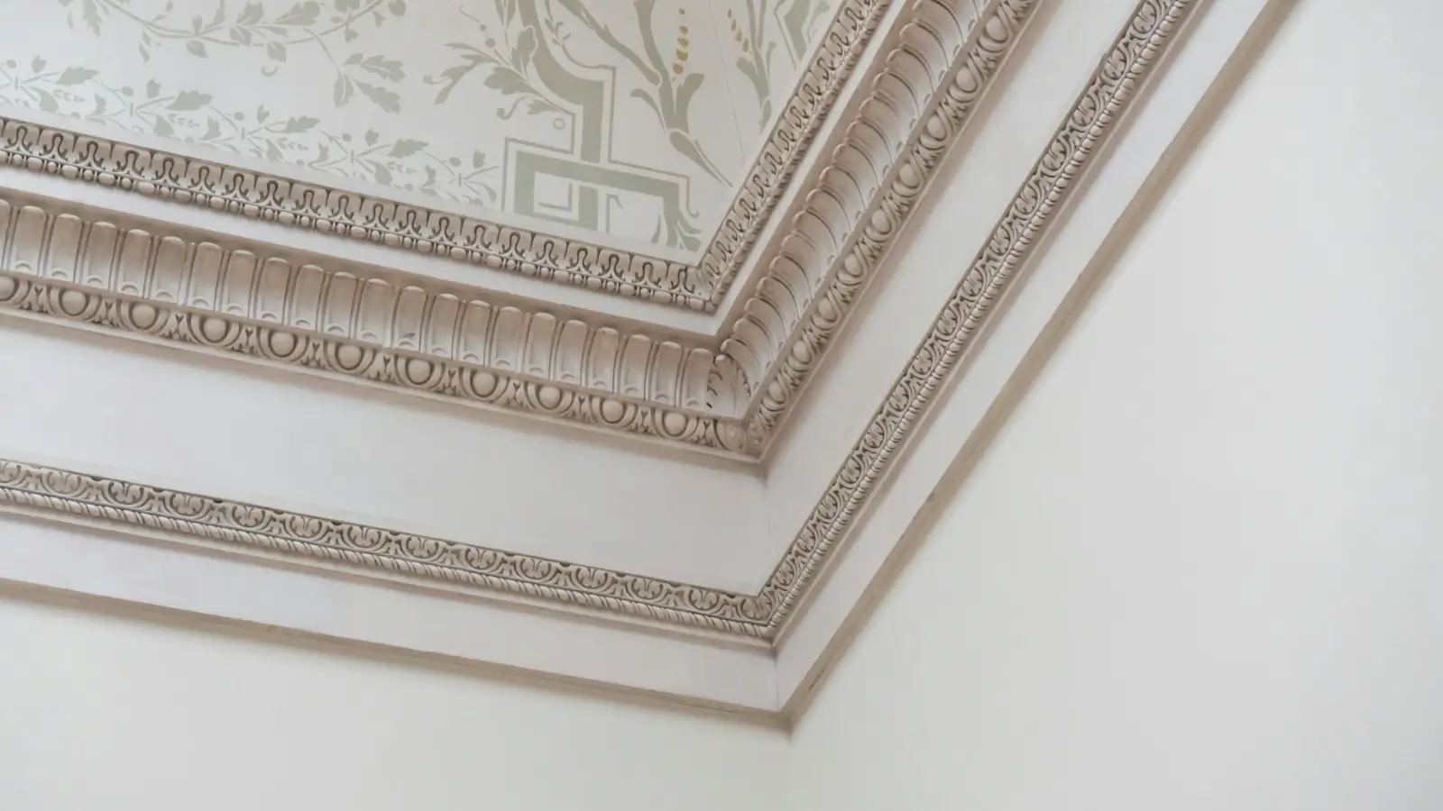
Creating Depth Through Layered Profiles
One mistake people make is picking flat, simple designs thinking they'll be timeless. Actually, what makes a cornice interesting is the shadow play. When light hits a multi-layered profile, you get these subtle shadows that change throughout the day. I've seen rooms completely transform just from morning to afternoon light because the cornice design had enough depth.
The classical approach uses what designers call "projection," which is how far the cornice sticks out from the wall. A good rule from architectural proportion studies suggests your projection should be about 1/12th of your ceiling height. So if you've got 10-foot ceilings, you're looking at around 10 inches of projection. That sounds like a lot, but it actually balances better than you'd think.
Matching Historical Periods Without Looking Like a Museum
If you're working with an older home, there's this temptation to match everything exactly to the period. But honestly? Sometimes that makes spaces feel frozen in time rather than lived-in. What works better is understanding the basic language of different eras and then adapting it.
Victorian cornices tend to be ornate with lots of carved details, sometimes incorporating egg-and-dart patterns or acanthus leaves. Georgian designs are more restrained, focusing on clean lines with maybe some dentil work. The egg-and-dart pattern, by the way, dates back to ancient Greece and represents life and death in alternating patterns. Pretty heavy meaning for a ceiling detail.
Playing With Scale in Modern Spaces
Here's where things get interesting for contemporary homes. You can take traditional cornice profiles and scale them way up or way down to create different effects. I've seen minimalist lofts use a super-sized simple cove molding that's like 18 inches tall, and it looks incredible because everything else in the space is so stripped back.
The technical term for this is "scale distortion," and it works because our brains expect cornices to be a certain size. When you mess with that expectation deliberately, it creates visual interest without adding complexity.
Color Strategies That Actually Work
Most people just paint their cornices the same color as the ceiling, usually white. Safe choice, sure. But if you want the cornice to really stand out, try painting it the same color as your walls instead. This draws the eye up and makes ceilings feel higher because the wall color literally extends further.
Another approach that's gaining traction is using slightly off-white shades. Benjamin Moore's "White Dove" versus "Simply White" might sound like splitting hairs, but when one is on your cornice and another on your ceiling, the subtle contrast makes the architectural detail readable without being obvious about it.
Business Outstanders brings you sharp insights on tech, business, entrepreneurship, law, crypto, and more. We uncover what’s next. Stay updated, sign up for our newsletter and be part of the future!