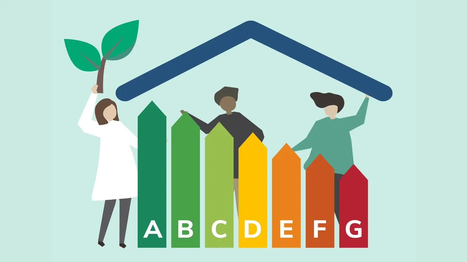
In today's data-driven world, effectively visualizing sustainability data is essential for conveying complex information in a straightforward manner. As issues like climate change gain greater urgency, understanding carbon emissions and energy use becomes critical. Bar charts stand out as one of the best tools for this purpose.
Bar charts allow for a clear representation of data, making it easier to identify trends and compare different metrics. Whether you're tracking carbon emissions over the years or comparing energy usage across various departments, a well-constructed bar chart can convey your message quickly and efficiently.
Read on to learn more.
Understanding the Basics of Bar Charts
One of the fundamental aspects of data visualization is choosing the right type of chart. Bar charts are particularly useful because they can represent both discrete and continuous data clearly. Unlike line charts, which can introduce ambiguity in certain datasets, bar charts offer a straightforward comparison between categories.
Typically, a bar chart consists of rectangular bars that represent the values of different categories. The length of each bar corresponds to the value it represents, enabling quick visual assessment. For instance, if you want to compare the levels of carbon emissions for different years, you can easily visualize which year had higher emissions and by how much.
Choosing the Right Data
Before creating a bar chart, selecting the right data is crucial. Consider what aspects of sustainability are essential to your analysis. For example, you might want to focus on:
-
Carbon emissions reductions
-
Energy consumption across different sectors
-
Waste management efficiency
-
Water usage per department
By selecting data that tells a clear story, you'll engage your audience from the start. For best results, use consistent time intervals, such as quarterly or annually, to observe changes over time easily.
Using Tools for Visualization
In the digital age, there are numerous tools available that make creating bar charts a seamless experience. Popular software options include Microsoft Excel, Google Sheets, and various data visualization platforms. Moreover, these tools offer templates and features that simplify the chart creation process.
To enhance your visual storytelling, you can incorporate additional elements like color coding for environmental impact severity or annotations for significant data points. Leveraging a free pie chart maker can also provide alternative visual representations to complement your bar charts.
Design Principles for Effective Bar Charts
Creating an effective bar chart involves more than just plotting data points on a grid. Several design principles can be applied:
1. Clarity in Chart Design: 5 Essential Guidelines
When creating charts, it's crucial to avoid overwhelming the viewer with too much information or too many categories. This can make the data look messy and hard to understand. In the end, it goes against the chart's purpose.
2. Strategic Color Selection
Differentiating between bars using contrasting colors is a simple yet effective way to enhance the chart's clarity. Using dark blue for one category and bright orange for another creates a clear visual difference. This helps viewers compare and analyze the data more easily.
3. Clear Labeling is Key
Labeling all axes and data points is key. It helps avoid confusion and lets viewers understand the data clearly. Clearly defining what each axis represents and labeling each data point can make a significant difference in the chart's effectiveness.
4. Providing Context through Descriptive Titles
Descriptive titles and context help us understand the data's importance. A short explanation helps viewers see why the data matters. It shows what the data means and what insights they can gain.
5. Accessibility in Chart Design
Finally, it's essential to consider accessibility when choosing colors for your chart. Choose colors that everyone can see, including those with color blindness. This makes your chart more inclusive and useful for a larger audience.
Adhering to these principles not only improves aesthetics but also enhances the message your data conveys.
Case Studies of Bar Charts in Sustainability
Many organizations utilize bar charts to communicate sustainability initiatives successfully. Here are a few real-world examples:
1. Corporate Sustainability Reports
Top companies, such as General Electric and Siemens, use bar charts. They track their carbon footprint over time. These charts compare current emissions to their ambitious targets.
2. Government Statistics
National environmental agencies, like the US Environmental Protection Agency (EPA), use bar charts. These charts show how energy efficiency has improved in different sectors over time. This helps policymakers justify their decisions, allocating resources more effectively to drive sustainable development.
3. Research Publications
Many academic studies use bar charts. They help show complex research findings. This makes it easier for readers to understand the results. For instance, a study might investigate the impact of renewable energy sources, such as wind and solar power, compared to fossil fuels on carbon emissions.
These examples illuminate how bar charts help in effectively communicating complex sustainability data to a broader audience.
Integrating Bar Charts into Presentations and Reports
For maximum impact, it's essential to integrate your bar charts into presentations and reports effectively. Here are some tips for doing so:
-
Position strategically
-
Engage your audience
-
Encourage questions
Utilizing these strategies can help ensure that your audience understands and engages with the data presented in bar charts.
Evaluating the Effectiveness of Your Bar Charts
After creating your bar charts, it's essential to evaluate their effectiveness. Are they achieving the intended purpose? To measure this, consider:
-
Clarity:
-
Engagement
-
Feedback
Gaining input from others can provide insight into how your bar charts perform, allowing you to make necessary adjustments for future visualizations.
Technology and Future Trends in Data Visualization
The landscape of data visualization is constantly evolving. Emerging technologies, such as artificial intelligence and augmented reality, are beginning to play a role in how we visualize data. For instance, AI can assist in identifying patterns that humans may overlook, while augmented reality can create immersive experiences for viewers.
Looking ahead, combining these technologies with traditional tools can provide better visualization options. Utilizing familiar tools while embracing technology is key to effective communication.
As data continues to grow in importance, mastering the art of making compelling bar charts will be invaluable. Start your journey today and enhance your sustainability reporting with a free pie chart maker to complement your bar charts and offer varied visual insights.
Harnessing Bar Charts for Sustainability Insights
In summary, bar charts serve as an effective method for visualizing sustainability data, providing clarity and insights into critical metrics such as carbon emissions and energy use. By selecting appropriate data, using the right tools, and adhering to design principles, you can create impactful visualizations that resonate with your audience.
For more helpful tips, check out the rest of our site today.


