Market analysis is often about timing, not just being right, but early. While many traders rely on technical indicators, economic calendars, or price action setups, those who consistently find opportunities before the crowd tend to look at something else first: the SP500 heatmap.
This simple but powerful visual doesn’t tell you what to trade. It tells you where to look.
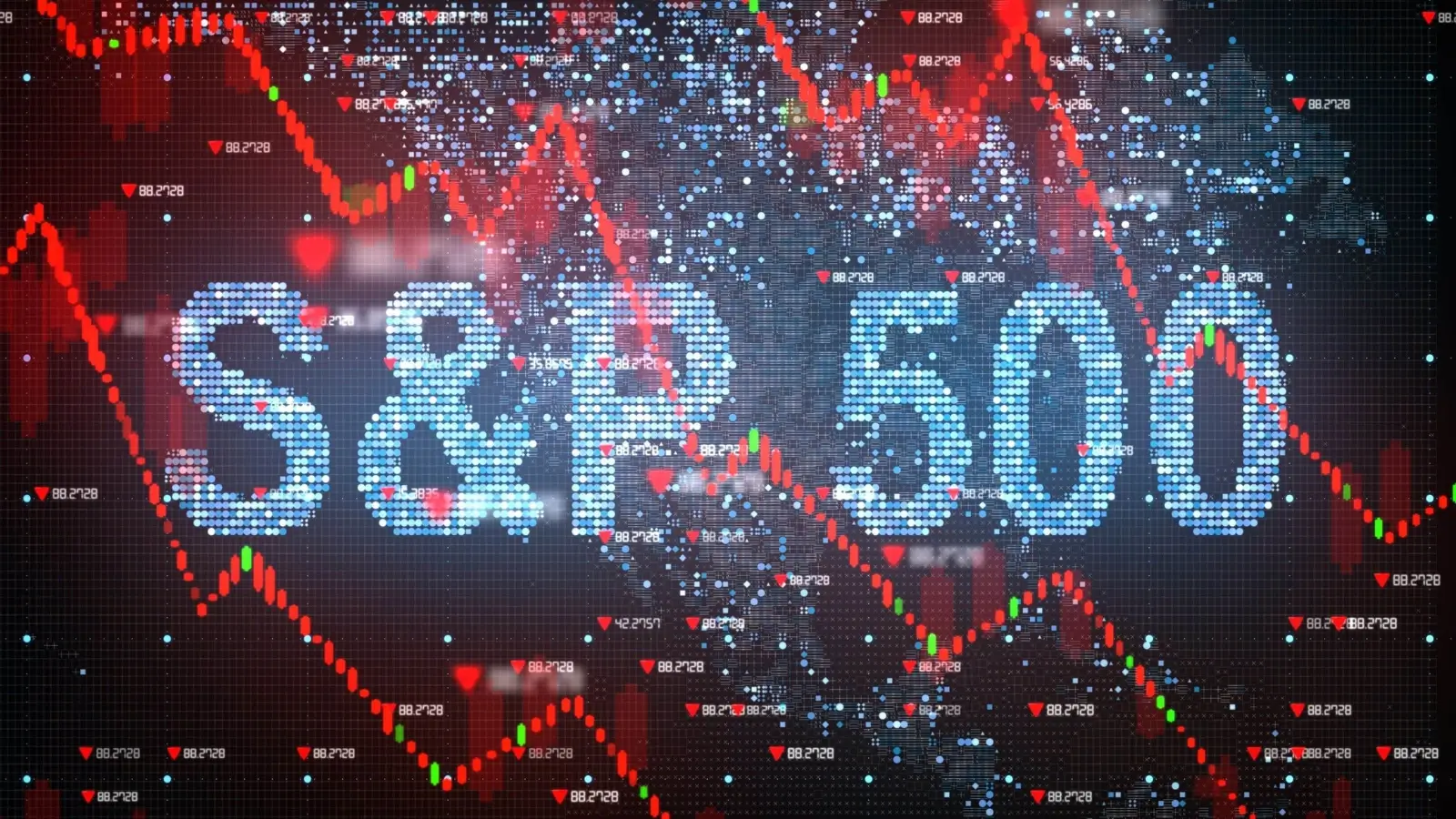
Understanding the Role of the SP500 Heatmap
The S&P 500 includes the most influential companies in the U.S. economy. It’s not just a benchmark, it’s a barometer of institutional positioning, sector performance, and macro sentiment. The SP500 heatmap allows traders to see all of this on one screen.
Each block on the heatmap represents a company, grouped by sector and scaled by market cap. The color of the block reflects price change: green for gains, red for losses, and deeper hues for more dramatic moves. One glance tells you which names carry the weight and which are lagging.
What makes this useful isn’t just the layout. It’s what the layout reveals about capital flow.
Why Traders Begin the Day with a Heatmap
Before looking at individual charts or scanning news, seasoned traders often start by checking the heatmap. It helps them read the temperature of the market. If energy stocks are glowing red while tech is flashing green, something is shifting in investor appetite.
Specific clusters might be acting together, all major banks moving higher, or healthcare names retreating in sync. These aren’t coincidences. They’re signs that traders with deep pockets are making moves. When you spot those moves early, you’re not reacting to price, you’re positioning ahead of momentum.
Spotting Themes with a Stock Market Map
The stock market map reveals more than daily fluctuations. It shows you patterns. Over time, you’ll notice that specific sectors lead during bull runs, while others outperform in defensive phases. Watching how these clusters change color daily helps you understand where the next rotation may occur.
Let’s say consumer discretionary names have been underperforming, but today they light up green across the board. That’s not noise, that’s attention shifting. It might reflect changes in interest rate expectations or new data on consumer spending. Either way, it’s a theme developing in real time, and a heatmap is one of the fastest ways to catch it.
How a Stock Heatmap Refines Trade Selection
Once traders identify the strong or weak sectors on a stock heatmap, they narrow their watchlist. Instead of scanning dozens of unrelated names, they focus on the few moving with volume and intent. This refinement matters. It saves time and sharpens focus.
For instance, if semiconductors are leading tech, a trader might focus on that group. If one name in that cluster outperforms its peers, it becomes a candidate for a breakout trade. Without the heatmap, spotting that opportunity would take much longer.
Combining the SP500 Heatmap with Other Tools
Heatmaps aren’t used in isolation. They’re paired with technical setups, price levels, and volume data. But the advantage is that they set the tone. They help traders ask better questions. Is this breakout part of a broader sector move? Is the weakness in financials isolated or part of a shift toward defensive assets?
Used this way, a heatmap becomes more than an image; it becomes context. And in markets, context is often what separates smart trades from lucky guesses.
Lessons from Watching the Market Flow
Reading the stock heatmap day after day builds intuition. Over time, you sense when a move is real or likely to fade. You learn to recognize when strength is supported by sector breadth or standing alone.
Even during flat market conditions, the map shows where pressure is building. It doesn’t predict the next breakout, but it gives you a shortlist of where to look when it happens.
Seeing Opportunities Before They Become Obvious
A heatmap doesn’t offer buy or sell signals. But it does offer clues. And in trading, clues matter. They lead you to ask the right questions, to spot the proper setups, and to act before the rest of the market catches up.
That’s the real power of the SP500 heatmap, not in what it tells you, but in what it helps you notice.
Business Outstanders brings you sharp insights on tech, business, entrepreneurship, law, crypto, and more. We uncover what’s next. Stay updated, sign up for our newsletter and be part of the future!